Art Deco in bespoke furniture: geometry, dark veneer, brass and mirrors. Learn the features, materials, colours and proven ways to a luxurious interior.
Art Deco is geometry and opulence combined: dark glossy veneer, marquetry, the sunburst motif, brass and smoked mirrors, all held within an iron symmetry.
What is the Art Deco style
Art Deco emerged in the 1920s as a response to restrained modernism and the ornamental excess of Art Nouveau. The name comes from the 1925 Paris exhibition of decorative arts, which showed the world a new language of luxury: geometric, dynamic and self-assured. It is the style of the jazz age, ocean liners and the first skyscrapers, where the richness of material meets the discipline of form.
Unlike Art Nouveau, which drew on the soft lines of nature, Art Deco speaks the language of simple figures: zigzags, stepped shapes, fans, circles and above all the sunburst motif. Every element has its place, and the whole is built around an axis of symmetry. This is luxury that is ordered rather than chaotic, where drama is born from the contrast of dark wood and gleaming metal, not from a surplus of detail.
The style has several variants. The Parisian version is more intimate and refined, based on noble veneers and marquetry. The American version, associated with skyscrapers and cinemas, is more monumental and theatrical. There is also the streamline moderne current, which softens geometry with aerodynamic curves. In a contemporary interior we most often reach for the toned-down version: we keep the characteristic visual codes but use them in moderation, so the home remains comfortable day to day.
For bespoke furniture, Art Deco is a natural choice, because its strength lies in detail that cannot be bought from a catalogue. Fluted fronts, veneer joined into mirror patterns, profiled plinths and gold-toned hardware demand workshop precision. It is a style in which design and craftsmanship matter more than the surface itself.
Key features of the Art Deco style
You will recognise Art Deco by a few recurring signals that together create an impression of planned opulence. Here are the most important.
- Geometry and symmetry. The composition rests on an axis: pairs of cabinets, twin lamps, mirrored front layouts. Patterns are regular, based on a repeating module.
- Dark glossy veneer. Walnut, rosewood or ebony in high gloss form the foundation of the palette. The grain is laid deliberately, in herringbone or mirror, to create a drawing.
- The sunburst motif. Fans, radiating lines and circles appear on fronts, in marquetry, in mirror divisions and in lighting.
- Fluted fronts and slats. Vertical grooves and ribs give surfaces rhythm and a play of light while keeping a clean, geometric form.
- Brass and gold. Frames, plinths, handles and trims in brass or brushed gold emphasise edges and add a warm gleam.
- Mirrors and smoked glass. Mirror panels, bronzed and smoked glass enlarge space and multiply reflections, reinforcing a sense of depth.
These elements rarely appear alone. The power of Art Deco lies in their combination: dark veneer needs a golden edge, a fluted front gains from a mirror insert, and the sunburst motif completes the composition as an accent. The key is restraint in the number of accents and consistency in detail.
It is worth remembering that the drama of this style does not come from the number of ornaments but from contrast and proportion. A single striking wall of fluted walnut joinery with brass lines makes a greater impression than ten small accessories scattered around the room.
Materials and colours
The basis of Art Deco is noble wood in a dark, warm tone. The most characteristic is walnut, with its expressive grain that takes on deep gloss once polished. In bespoke furniture we lay walnut veneer in herringbone, in mirror or in bands, so that the drawing of the wood itself becomes an ornament. Where large surfaces need stability, we reach for high-quality European-class boards, veneered and lacquered, which hold the geometry of the fronts without warping.
The colour palette is deep and saturated. The base is usually walnut and black, to which we add one strong colour: bottle green, navy or dark burgundy. Gold and brass play the role of light in this dark composition, so they appear sparingly, on edges and hardware. Such a palette is demanding, so in smaller interiors we lighten it with cream or sand surfaces to keep it breathing.
Texture matters as much as colour. Art Deco loves the contrast of matte and gloss: matte velvet upholstery next to a mirrored front, smooth lacquer beside brushed metal, cold glass against warm wood. Stone also has its place, especially marble with expressive veining, used on worktops, sills and fronts as a decorative element. Smoked and bronzed glass introduces soft reflections without dazzling.
The durability of this aesthetic depends on the quality of the finish. High-gloss lacquered fronts require a perfectly prepared substrate, and gold-toned hardware must resist abrasion so it does not lose colour. That is why we choose European-class materials and certified hardware, which after years look as good as on the day of assembly. Well-executed Art Deco does not go out of fashion, because it rests on proportion rather than a passing trend.
Who the Art Deco style is for
Art Deco is a choice for people who value luxury but cannot stand randomness. It is an aesthetic for someone who likes an interior with character that tells a story while remaining orderly. It works well for owners of spacious apartments and penthouses, where a dark palette and striking fronts have room to resonate. In interiors for the home it works best where there are high ceilings and good light to bring out the gloss of veneer and metal.
The style also feels at home in commercial spaces that are meant to impress. Reception areas, offices, boutiques, restaurants and hotel lobbies gain a sense of prestige and timelessness with it. In projects for business Art Deco builds the image of a premium brand without being loud, because its luxury is written into material and geometry, not into temporary add-ons.
It is not, however, a style for fans of austere minimalism or for people who frequently change their arrangements. Art Deco demands decisions and consistency: once we choose a palette and a leading motif, it is best to keep to it throughout the space. In return it gives an interior that looks mature and expensive even after many years.
How to introduce the Art Deco style in bespoke furniture
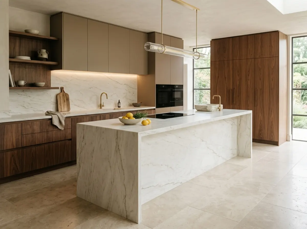
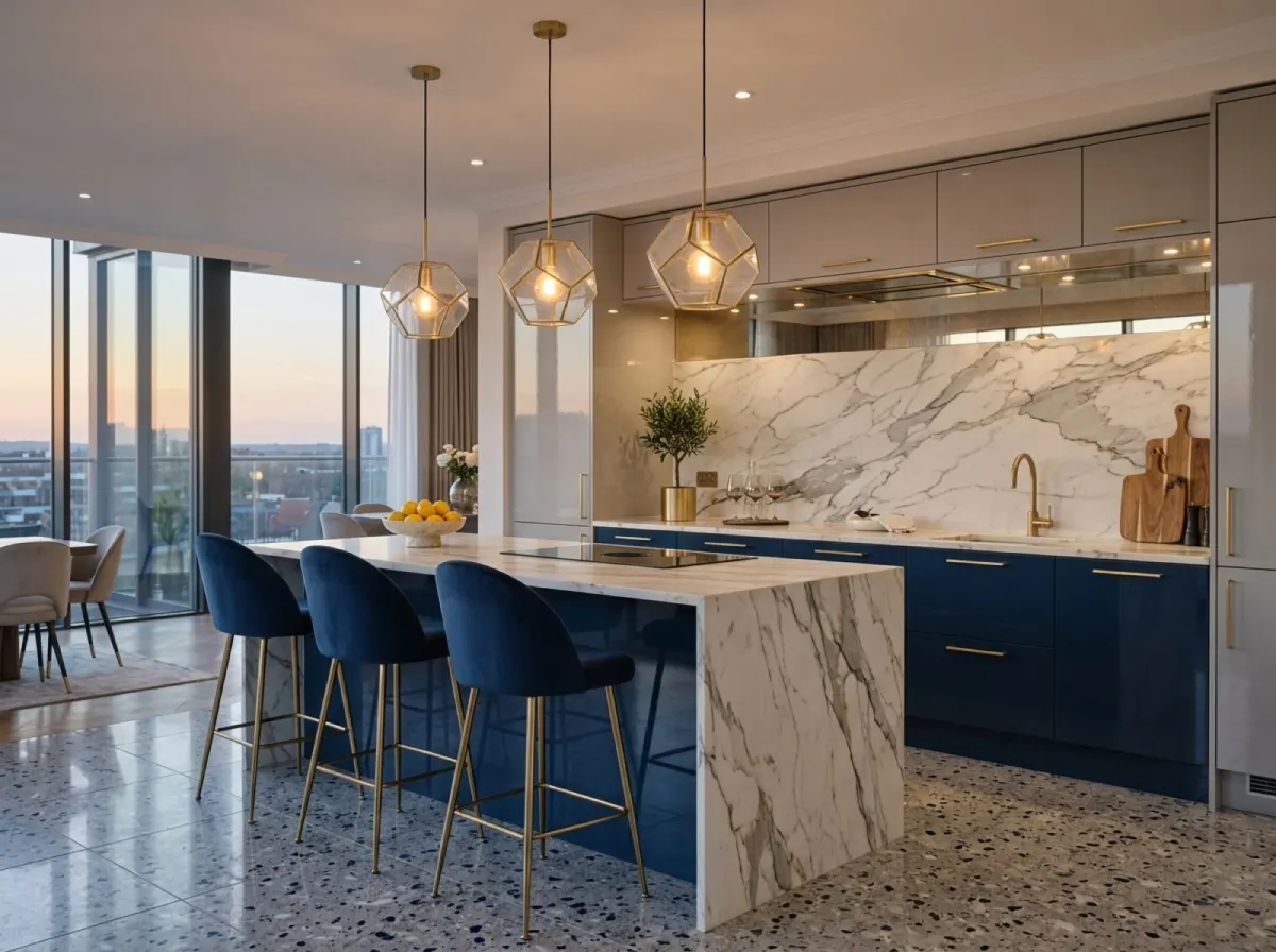
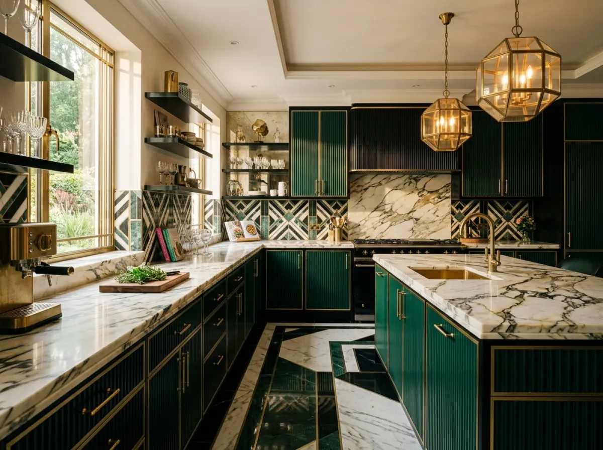
In the kitchen, Art Deco shows itself through dark, fluted fronts in walnut or lacquer, finished with brass trims and gold-toned handles. The island is often a central, symmetrical element, frequently with a worktop of marble with expressive veining. Floor-to-ceiling joinery with a vertical slat division orders the wall and gives it rhythm, while backlit shelves of smoked glass bring depth.
In the dressing room and wardrobes, this style shows its full potential. Fronts arranged from veneer in mirror patterns, display cases of smoked glass in brass frames, profiled plinths and symmetrical division create the impression of joinery tailored to a wealthy interior of a bygone era. Inside, we use lighting of niches and rails that displays the contents as in a boutique. Examples of such projects are shown in our portfolio.
In the living room and bedroom, Art Deco is built around wall joinery and pieces that act as accents. Chests of drawers with a sunburst motif in marquetry, mirrored wardrobe fronts, headboards upholstered in velvet of deep green or navy. Symmetry is the rule here: two identical bedside tables, a pair of lamps, mirrored front layouts on both sides of the axis.
Built-in lighting is an inseparable part of this style. Linear LED profiles emphasise the edges of fluted fronts, spot light brings out the grain of veneer, and backlit niches and display cases turn joinery into a decorative element after dark. In bespoke furniture we plan the wiring and lighting control at the design stage, so the effect is clean and free of visible cables.
The Art Deco style in different rooms
Art Deco can be introduced throughout the home, but it works slightly differently in each room. Below is a short guide to the zones.
Kitchen
Here what matters is the contrast of dark fronts with light, veined stone and brass details. Fluted fronts and a symmetrical island give the kitchen a representative character, while backlit display cases of smoked glass bring depth. It is worth limiting the number of colours to two or three so the whole remains elegant.
Living room
The living room is a stage for Art Deco. Wall joinery in dark veneer with a sunburst motif, mirror inserts and brass trims build a striking backdrop for the daytime zone. A symmetrical layout around a fireplace or a TV wall orders the space and reinforces the impression of planned luxury.
Bedroom and dressing room
In the bedroom, Art Deco means calm drama: a dark, velvet headboard, symmetrical bedside tables and smoked mirrors. A dressing room with veneered fronts in a mirror pattern, display cases and niche lighting becomes a private boutique in which clothes and accessories are on display.
Bathroom and entrance zone
In the bathroom, marble with expressive veining works well, along with black fittings in a gold tone and geometric mirror divisions. An entrance zone with mirrored joinery, brass handles and a bench upholstered in a deep colour signals the character of the whole interior from the threshold.
Well-designed Art Deco gains value over time, because it rests on durable materials and timeless geometry rather than seasonal fashions. Noble veneer and certified hardware look mature after years, not worn out.
At the same time, the style allows an individual accent. You can choose your own leading colour, a favourite geometric motif or one striking sculptural piece that becomes the signature of the interior. It is an aesthetic expressive enough that a few strong gestures are enough to create a whole.
The most common mistakes
The most common pitfall of Art Deco is excess. When too much gold, mirror, pattern and colour meet in one room, the interior begins to resemble a stage set rather than a place to live. The remedy is hierarchy: one dominant gesture, for example a fluted wall of joinery, with the rest of the details acting as background and complement.
The second mistake is confusing gloss with quality. Cheap, shiny surfaces quickly betray imperfections in the substrate and scratches, and gold hardware with a poor coating loses its colour. Art Deco mercilessly exposes savings on material, which is why it is better to do less but with good veneer and certified hardware than a lot with cheaper substitutes.
The third pitfall is a lack of symmetry and order. Art Deco without a compositional axis loses its character and turns into a random collection of decorative furniture. Before selecting details, it is worth establishing lines of symmetry and a repeating module on which to build the whole interior.
The fourth mistake is ignoring the scale of the room. A dark palette and massive fronts in a small, poorly lit interior can overwhelm it. In such cases we lighten the base, limit dark surfaces to a single wall and rely on mirrors and light that add space.
How we do it at Grandis
We have been designing and producing bespoke furniture for over 15 years, in our own facility of 3 000 m², where we have completed over 300 projects. We begin every project with a laser measurement and a 3D visualisation, which is included in the price, so that even before production you can see how the geometry of the fronts, the layout of the veneer and the brass details will play together. In Art Deco this is crucial, because the effect is decided by proportion and symmetry, not by improvisation on site.
We work with European-class materials and certified hardware, and assembly is carried out by our in-house team, not subcontractors, which translates into consistent finishing quality. A standard project takes 2-4 weeks, and we set the price as a fixed one, without addenda during the work.
In Art Deco there is no room for chance: what counts is the axis of symmetry, the clean edge and consistent detail. That is why we plan everything at the 3D design stage and, during assembly, simply put together a finished composition.
Frequently asked questions
Does Art Deco suit a small apartment?
Yes, provided it is dosed carefully. In a smaller space we lighten the base, limit dark fronts to a single wall and rely on mirrors, smoked glass and good light, which add depth and enlarge the interior.
Are dark, glossy fronts practical?
High gloss requires regular wiping, because fingerprints show on it. In heavily used zones we suggest combining gloss with matte or satin and fluted fronts, on which reflections mask minor smudges.
How does Art Deco differ from glamour?
Glamour focuses on softness, sparkle and abundance, while Art Deco focuses on geometry, symmetry and discipline of form. Both styles like gold and mirrors, but Art Deco is more ordered and graphic, and less decorative.
Which colours work best in Art Deco?
The base is walnut and black, and as the leading colour we choose bottle green, navy or dark burgundy. Gold and brass appear as an accent on edges and hardware, not as the main surface.
Is the Art Deco style suitable for an office or a commercial space?
Yes, it builds a premium image very well in reception areas, offices, boutiques and restaurants. Geometry and noble materials look representative while remaining timeless.