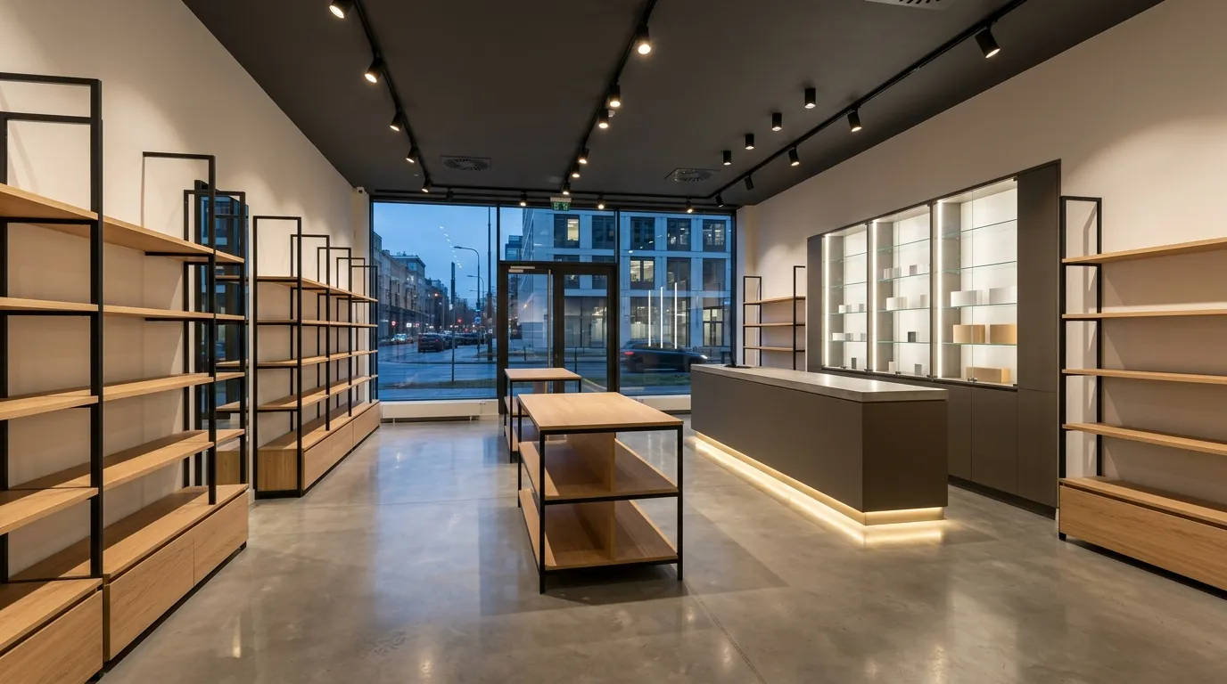
Visual merchandising (VM) is the way a store presents its goods so that customers notice them, understand them and reach for them. It covers the floor layout, the height and width of displays, the shop window, lighting and furniture. The quickest results come from tidying up the entrance zone and the shelves at eye level, because that is where customers look first.
In this article
- Visual merchandising: what it is and what it includes
- Where to start: a five-step store review
- Visual merchandising principles: eight rules of product presentation
- Shop window displays and lighting
- Furniture that makes visual merchandising easier
- Clothing store, small shop and chain: what changes
- Visual merchandising online
- Frequently asked questions
Visual merchandising (VM) is the way a store presents its goods so that customers notice them, understand them and reach for them. It covers the floor layout, the height and width of displays, the shop window, lighting and furniture. The quickest results come from tidying up the entrance zone and the shelves at eye level, because that is where customers look first.
Most of the rules in this article can be applied without a renovation. There is one condition. The shelving has to let you move shelves, rails and hooks, while fixed, rigidly screwed-down furniture closes that path. That is why, alongside the rules themselves, we show how fittings from our projects make merchandising easier in a sports store, a clothing boutique, a children's shop and a home decor store.
Visual merchandising: what it is and what it includes
Merchandising is everything a store does to get customers to buy on the spot. It includes the product range, stock levels, placement on shelves and price labels. Visual merchandising is its visual side. It shapes what customers see from the entrance to the checkout, and the order in which they see it.
In practice, VM covers six areas:
- the floor layout and the route customers walk
- presentation on wall shelving, islands and tables
- the shop window
- lighting
- signage and wayfinding
- the furniture and materials the displays are built from
In retail chains, this is the job of a visual merchandiser, the person who sets the presentation standard and makes sure stores keep to it. In a small shop, the work usually falls to the owner or the manager. The rules are the same; only the scale differs.
Where to start: a five-step store review
Before you move anything, it pays to see the store through a customer's eyes and compare that with your sales figures. The five steps below need only a phone, a sales report by category and one unhurried walk around the floor before opening or after closing.
- Walk in like a customer. Stand in front of the window on the street or mall side, then walk in and go through the whole floor. Note where your gaze stops on its own, where you have to squeeze past, and what is hidden behind the shelving.
- Photos of walls and islands. Photograph every wall and every island from a few steps away. A photo immediately reveals clutter, gaps and products blocked by other products.
- Check against the till. A sales report by category shows which product groups are underperforming. Often these are items placed lowest, in a corner or behind a pillar.
- Change one zone. Start with a single spot, such as the first wall past the entrance or the island by the checkout. Compare sales in that category before and after the change, on the same days of the week.
- A written standard. Photograph a good layout and leave it with staff as a "this is how it should look" reference. Without it, the shelf slips back to its old state after two deliveries.
Visual merchandising principles: eight rules of product presentation
These rules come up again and again in textbooks and in the practice of retail chains. They work best together, but each one can be tested on its own in a single zone of the store.
- Keep the entrance zone calm. For the first few meters past the door, customers slow down and only then start looking around. Small items and promo bins go further in. Right at the entrance, a single clear arrangement visible from afar works better.
- The first wall works hardest. The common assumption is that customers turn right after entering, so new arrivals and key categories go there. You can easily check this in your own store by watching a dozen or so shoppers. The position of the entrance and the checkout can reverse this direction.
- The most important items at eye and hand level. The middle shelves get looked at most often. Heavy, large goods sit low, while light, bulky ones can go high.
- More facings mean more attention. A facing is one visible unit of a product on the shelf. In an eye-tracking study (using a device that follows eye movement) published in 2009, the number of facings strongly influenced brand evaluation, and did so purely by drawing the eye. The experiment was run on supermarket shelves. The effect was especially clear for new brands and brands with a small market share, for loyal customers of the brand, and for people who came to buy rather than just browse. So it is better to show a new product as two or three units side by side than as one.
- Things that go together stand together. A shirt next to a tie, a candle next to a candlestick. The customer gets a ready-made set and does not have to hunt for it around the store.
- A triangle composition. The tallest element stands in the middle or at the back, and lower ones step down toward the front and the sides. The eye moves across such an arrangement from top to bottom and sees every product.
- Color in blocks. Goods are grouped in patches of one color or arranged from light to dark. The background, meaning the furniture and walls, stays neutral so the color comes from the merchandise alone.
- Leave breathing room between products. An overloaded shelf looks like a clearance sale and tires the eye. It is better to leave empty space and keep backup stock in the back room or in drawers under the display.
This work on attention has its limit. The authors of the cited study note that catching the eye does not always translate into sales. Some shelf positions increased attention but did not improve how the product was rated.
One change at a time. If you change the window, the lighting and the shelf layout in the same week, you will not know what worked. Change one zone and compare sales in that category.
Shop window displays and lighting
A shop window has one job: to stop passersby and invite them inside. A single theme works better than an overview of the whole range. The theme changes with the season or a new collection. It is worth keeping the window lit in the evening too, after the store closes.
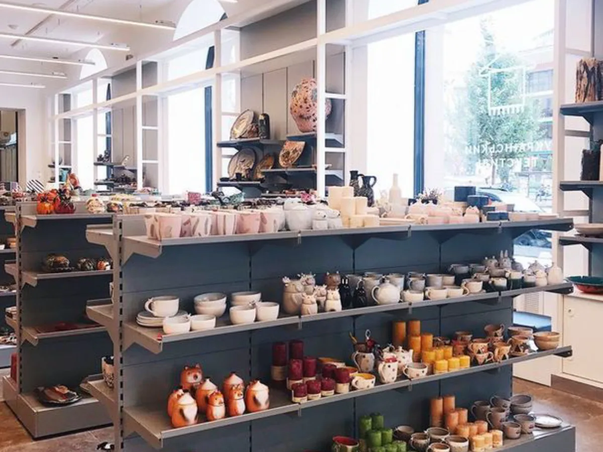
A window can be closed off with a back panel or open onto the sales floor. We build both, and the choice depends on the store. A closed window gives a stage for one composition. An open one shows the whole shop from the street and lets daylight in. In the home decor store, we placed open-frame shelving by the windows, so the goods are visible from the street and light reaches the floor (see the project).
Store lighting works in layers. General lighting lets people move around comfortably. Accent lighting picks out selected spots, such as the window, an island with new arrivals and the wall at the back of the store. Decorative lighting sets the mood. A well-arranged display without accent lighting easily gets lost on the floor.
Furniture that makes visual merchandising easier
Presentation rules run up against furniture. If shelves are screwed in permanently, every change of season means new fittings or a compromise. That is why, in the stores we fit out, flexibility is usually built into the furniture structure itself. Below are four solutions from our projects.
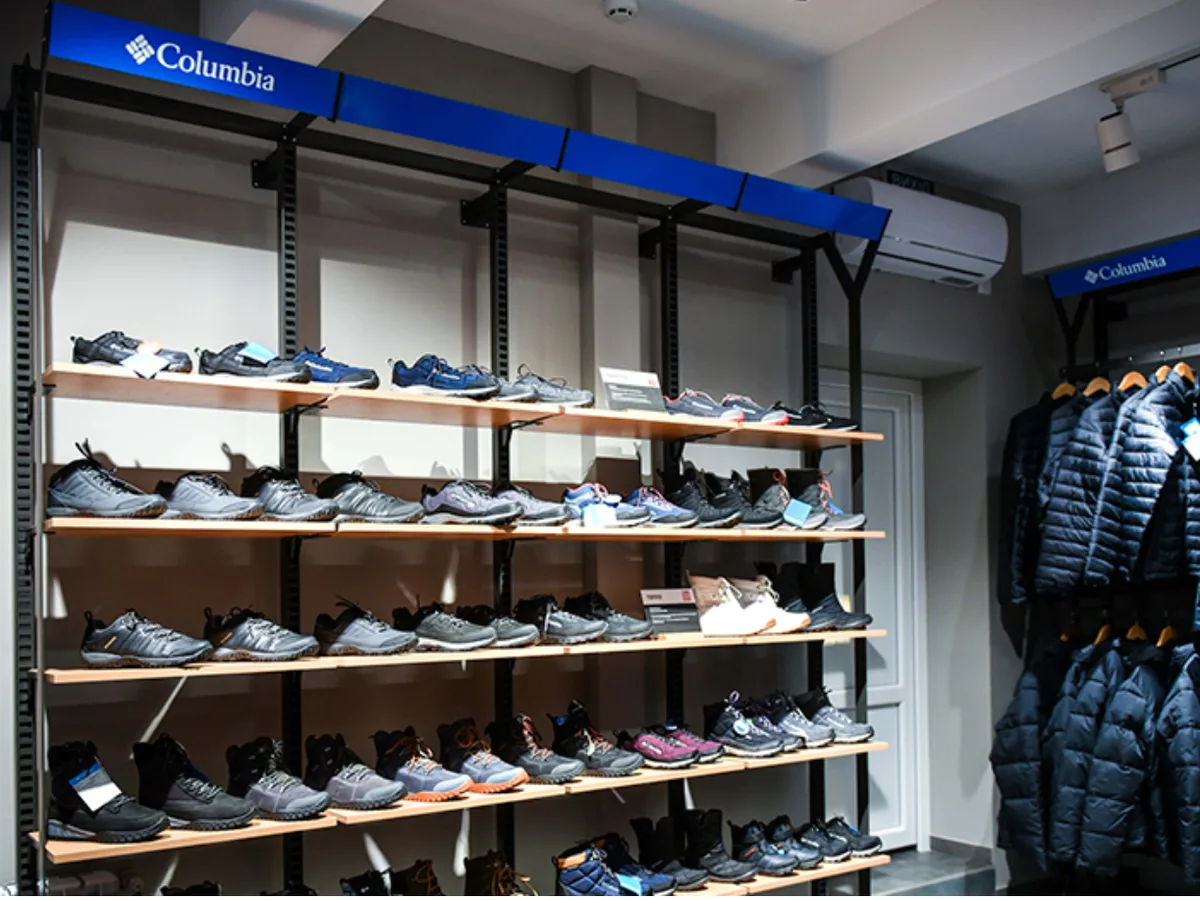
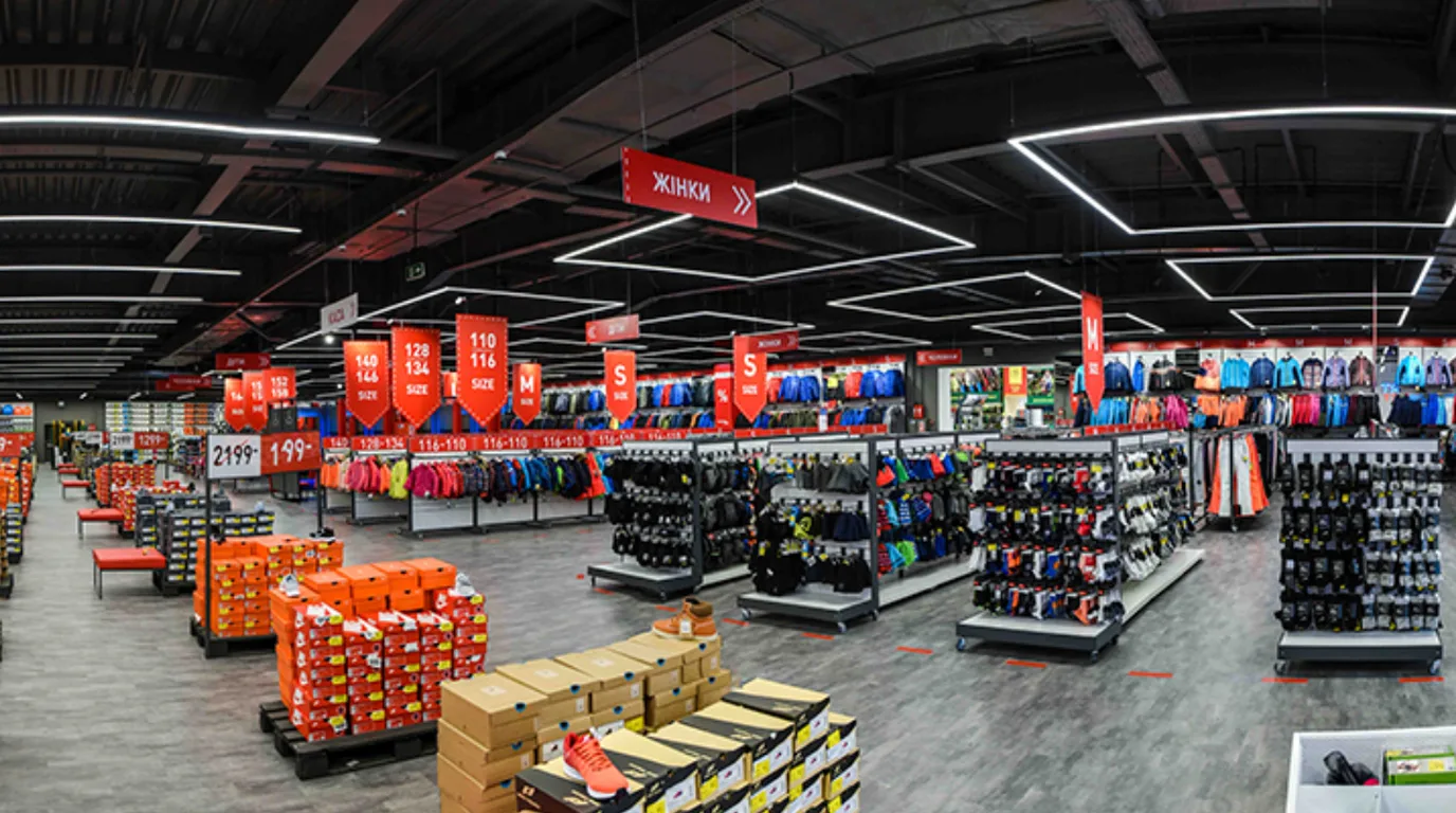
- Perforated wall uprights. Shelves, rails and hooks all hang on the same tracks. In the sportswear store, the jacket section can be turned into a footwear wall without new furniture. In the children's shop, the hanging height changes for the new season while the furniture stays.
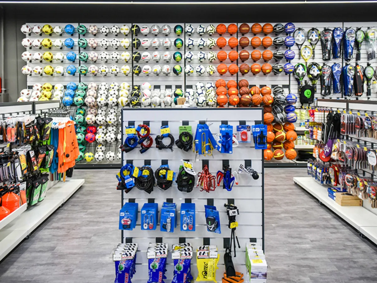
- Tall walls and low islands. In the outlet-format sports store, grooved wall panels, known as slatwall, run full height. Hooks and shelves can be moved on them without tools. Gondolas, meaning freestanding double-sided units, stand in the middle of the floor and are lower than eye level, so they do not block the view of the room or the signage.
- Stepped shelves at different heights. In the home decor store, shelves in neighboring sections are offset from each other, so a tall item has room without leaving an empty level above a short one. The double-sided gondolas have shelves that narrow toward the top. As a result, the lower level is not hidden in the shadow of the upper one.
- A neutral background. In the same store, the frame, brackets and back panels were painted one light gray. The furniture recedes, and the eye sees the ceramics and textiles. In the children's shop, light wood-look and white furniture does not compete with the colorful merchandise.
The checkout is part of the presentation too. In the sports store, each till has a large number, so customers can see from afar which one is open. In the clothing boutique, the counter and the wall behind the cashier were clad in slats in the brand color, which makes the checkout visible from anywhere on the floor.
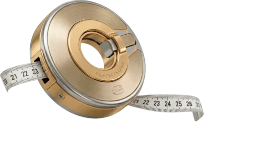
If you are planning new shelving, islands or display units, we help choose a system that changes along with your range. We cover this in more detail on our custom shop fittings page. The first on-site step is a free measurement of the space, with no obligation.
Order fittings before the season. Production usually takes 2–4 weeks from design approval and the deposit, and we put the specific date in the contract. Measurement, design and installation come on top of that, so it is worth deciding on new furniture well in advance.
Clothing store, small shop and chain: what changes
The rules are shared, but the type of store shifts the emphasis. Below are three typical situations.
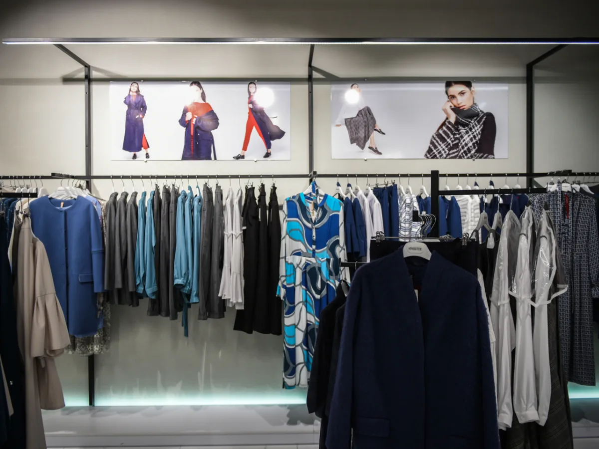
Visual merchandising in a clothing store. Clothing is shown in two ways. Side hanging fits many pieces, while front hanging shows the cut and color. Usually both are combined on one wall. A mannequin or a stand with a complete outfit suggests what to wear an item with and sells several products at once. For small garments, such as children's clothes, rails run on two levels, and folded items sit higher up on shelves.
Small shop. On a few dozen square meters, every piece of furniture in the middle of the floor takes away walking space. It is better to use the walls to full height and leave one low island or table in the center. One strong spot visible from the entrance works better than five average ones.
Store chain. In a chain, consistency is what counts. The same presentation standard requires the same furniture in every location and a photo guide for staff. This kind of shelf placement plan is called a planogram. When opening new stores, fittings are made to one standard so the planogram fits everywhere. We describe how such a project runs from initial requirements to installation in our article on custom shop fittings.
Do it yourself or hire a company? Chains usually have a visual merchandiser on the team. A small shop can start on its own with the five-step review, and a one-off consultation with an independent VM specialist makes sense at an opening or a refit. Our part of this work is the furniture the displays stand on: design, manufacturing and installation.
Staff need to know the rules. Even the best display falls apart after a few deliveries if the person stocking the shelves does not know what it should look like. A reference photo at each zone helps keep that look.
Visual merchandising online
In an online store, the product list in a category plays the role of the shelf, and the home page and banners play the role of the window. The rules are similar to those in a physical shop. What customers see in the first row of the list works like a shelf at eye level. E-commerce platforms let you set the order of products in a category manually and pin a chosen item permanently to a specific position.
Several rules carry over directly. Photos within one category are shot on the same background and with the same framing, because that is how the neutral furniture background works in a store. Complementary products are shown alongside, on the product page or in the cart. A new arrival gets a spot at the top of the list, just as in a store it gets several facings.
Frequently asked questions
How often should you change a display?
The window is usually refreshed with the season or a new collection. Shelves are tidied after every delivery according to the reference photo. There is no point in making more frequent changes without checking whether the previous one had an effect.
Does visual merchandising require new furniture?
Not always. The entrance zone, colors, number of facings and accent lighting can be improved with your current fittings. New furniture is needed when shelves cannot be moved or the shelving blocks the view of the floor.
How can you tell whether a change worked?
Compare sales in one category before and after the change, on the same days of the week. It also helps to watch whether customers stop at the new arrangement and pick items up.
What is a planogram?
It is a diagram or photo showing exactly where each product stands and in how many units. It keeps the shelf looking the same no matter who stocks it.
What affects the cost of new store fittings?
The floor area, the number of shelving units and islands, the materials, and whether the fit-out is to be repeated across several locations. We give the exact amount after measurement and design. The price in the contract is fixed and changes only if the client changes the scope.
Do you take on projects outside Warsaw?
Yes, we work in other cities in Poland and across Europe. Travel and installation costs are agreed in advance and included in the quote.
We have more than 15 years of experience and 300+ completed projects, including clothing, sporting goods, home decor and children's stores. If a refit of your sales floor is already in the plans, a good place to start is a free measurement.