A green kitchen looks best in a light, warm shade or as one accent, like an island or the lower cabinets. Black and graphite kitchens need a large window, a light worktop and several light sources. Grey is the safest choice and should be light in a small room. Beige warms up a north-facing kitchen with cool light.
In this article
- Three questions before choosing a colour
- Green kitchen: shades and combinations
- Black and graphite kitchens: how not to overwhelm the room
- Grey kitchen: cool, warm, light
- Beige kitchen: warmth when light is weak
- Navy kitchen: a colour to use in doses
- Colour in a made-to-measure kitchen: from colour chart to order
- Frequently asked questions
A green kitchen looks best in a light, warm shade or as one accent, like an island or the lower cabinets. Black and graphite kitchens need a large window, a light worktop and several light sources. Grey is the safest choice and should be light in a small room. Beige warms up a north-facing kitchen with cool light.
Three things decide the choice. The first is how much daylight there is. The second is the size of the kitchen and whether it can be seen from the living room. The third is what stays, namely the floor, windows and worktop. In practice, where to put a colour often matters more than the colour itself. In several of our kitchens a strong colour deliberately does not cover all the units. Graphite stays only at the top, black is broken up by a niche in a wood-effect finish, and green gets just one piece of furniture, the island.
Three questions before choosing a colour
A kitchen colour is chosen in order. Light first, then the size of the room, and finally how it works with what will not change. The same shade looks different with a north-facing and a south-facing window, in a kitchen open to the living room and in a separate one. That is why a catalogue is only a starting point.
How much light there is. North light is cooler and stays diffused all day. Colours look cooler and greyer in it than on a screen. Such a kitchen works better with colours that have a warm note, such as beiges, warm greys and warmer greens like olive. Greys and whites are also best chosen in a warmer version.
How big the kitchen is. Dark colours make a room look smaller, light ones make it look bigger. The smaller the kitchen, the lighter the main colour should be. A darker shade can then go on some of the cabinets, the worktop or the shelves. A kitchen open to the living room often gets more light from the living room windows, so it copes better with darker fronts. How to separate the zones in such a layout is covered in our article on the open-plan kitchen.
What is already in the room. The floor, window frames and worktop stay for years. The fronts are matched to them, not the other way round. So it is worth looking at a colour from the chart next to a piece of the floor and the worktop.
| Colour | Where it works best | What to pair it with | What to watch out for |
|---|---|---|---|
| Light green (pastel, mint, olive) | small and medium kitchen, north light | wood, white, gold or brass details | bright colours next to green |
| Dark green (bottle green) | bright kitchen, accent on the island or lower row | light worktop, wood, gold | in a small kitchen it overwhelms as the whole run |
| Black | large windows, kitchen open to the living room | oak, light worktop, glazing | needs several layers of light |
| Graphite, anthracite | medium and large kitchen, modern interior | white worktop, white tiles, wood | shade names differ between manufacturers |
| Light grey | any size, including a small kitchen | white, honey and dark wood | pure grey is cool |
| Beige, greige | north light, classic and warm modern kitchens | black worktop, wood, white | needs a dark or wooden contrast |
| Navy | bright kitchen, accents in a smaller one | white, brown, warm gold | too much of it makes the room gloomy |
Check the colour in the kitchen's own light. Look at the colour from the chart for a few days, in the morning, at midday and in the evening. In the evening, use light of the same colour temperature that the kitchen will have.
Green kitchen: shades and combinations
A green kitchen has two faces. Light pastel green makes a room look more cheerful and suits a small space well. Dark green, such as bottle green, adds depth and gravity but needs light. The most popular shades are bottle green, olive and mint. Shades toned down with grey also belong to this group.
Green is a strong colour and does not need many competing colours around it. The safest combinations are wood, white and black. Wood appears on the worktop or on open shelves. Black looks good on appliances and handles. Dark green is nicely set off by warm gold. Pastels in other colours and bright colours next to it are best avoided.
There are three ways to bring green in.
- All the units. Works in a light shade or in a kitchen with a large window. In a small kitchen, dark green on every front closes the space in.
- One level. Green lower cabinets and light upper ones, or the other way round. The light level keeps things airy, and the colour is still clearly visible.
- One piece of furniture. An island, peninsula or tall unit in colour, with the rest in wood or white.
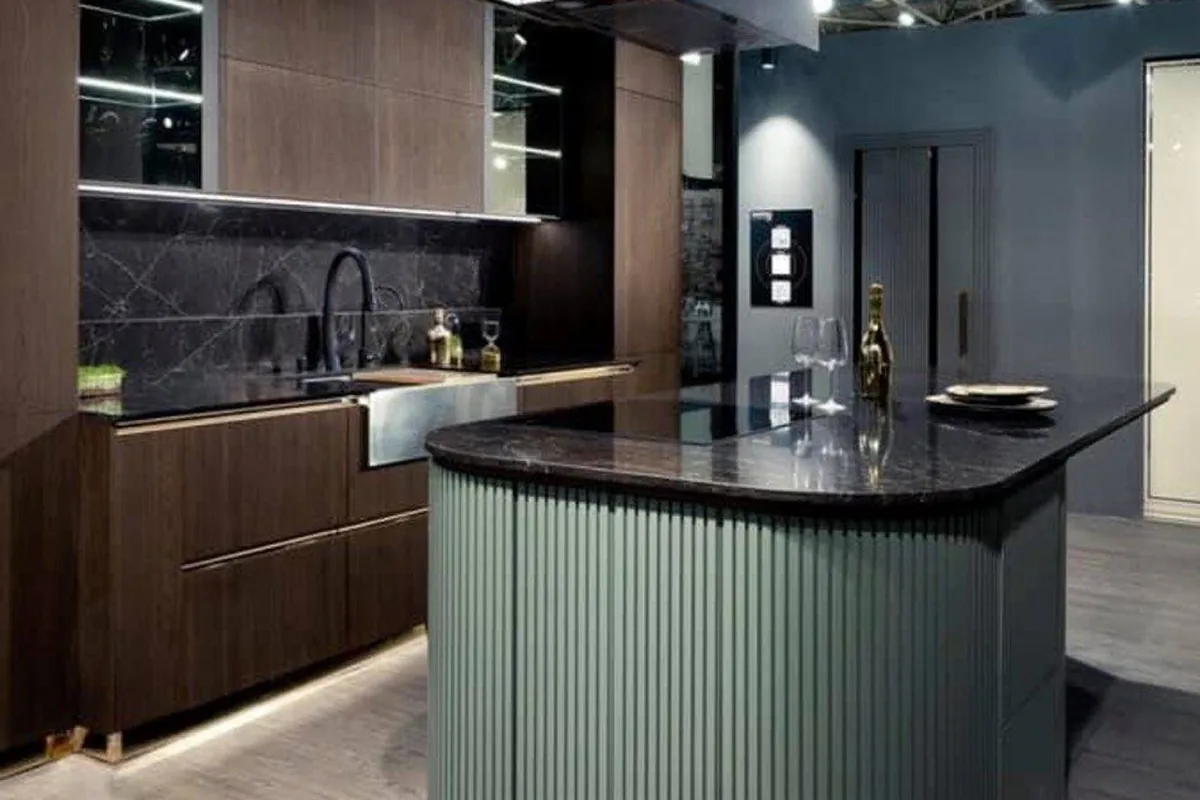
The third way is shown by our light green island with a rounded fluted front. We made it for a showroom display, where it stands with units in a dark walnut finish. The island is the only coloured element. Around it are display cabinets with lit shelves, gold profiles instead of handles, and a worktop and wall with a dark marble pattern. One accent piece brings in colour without making the whole kitchen colourful. It is a good choice for people who worry they will soon tire of green.
Black and graphite kitchens: how not to overwhelm the room
A black kitchen needs more attention to lighting, simply because it is darker. It works with large windows, in a kitchen open to the living room and with several light points. If black is going into a small kitchen, it is better to choose a lighter shade of it, such as anthracite, and not let it dominate. Black is broken up with wood, a light worktop or glazing.
Lighting in a dark kitchen is planned in layers. General ceiling lighting is the first layer. The second is pendants over the table or island. The third is task lighting over the worktop, the hob and the sink. The fourth is lighting inside the units. The light should be warm or neutral. Details are in our article on worktop lighting.
Three of our projects show three approaches to a dark kitchen.
- Black with a wooden niche. The matt black kitchen with an island is in a detached house and is open to a living room with panoramic glazing. The flat handleless fronts match the colour of the window frames. We marked out the sink area with a framed niche in an oak finish. The warm wood breaks up the black surface and shows at once where the water is in the kitchen.
- Graphite only at the top. In the L-shaped graphite and wood kitchen the brief was a dark kitchen that would not overwhelm the room. Graphite stayed only on the upper cabinets. The base units and the tall unit got a warm oak finish, and a light band of worktop and wall runs between them.
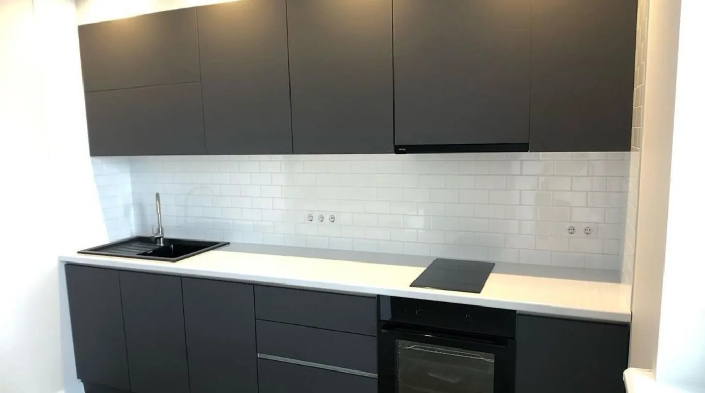
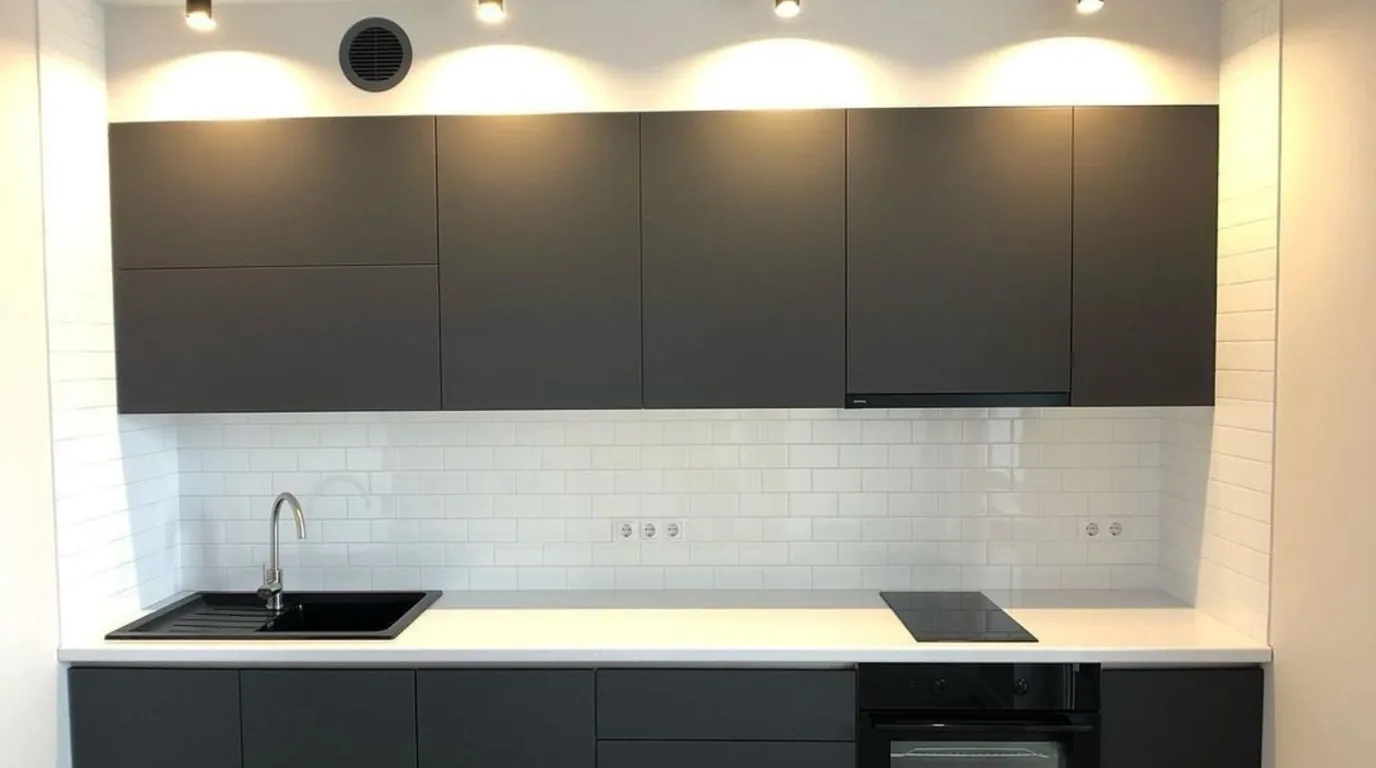
- Graphite with a white centre. The single-wall kitchen in matt graphite stands in a recess of a kitchen combined with the living room. The dark colour is balanced by a light centre, a white worktop and a panel of white gloss tiles that reflect light.
Graphite and anthracite are two dark greys close to black. Their names are not standardised, though, and different manufacturers use them for different shades. So when ordering, compare actual chart numbers rather than names.
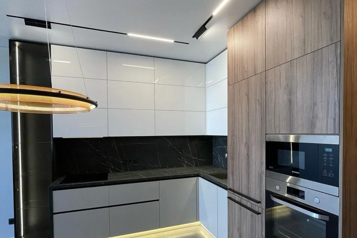
The finish of the lower fronts is also chosen with daily use in mind. In the kitchen with white gloss at the top and grey matt at the bottom we made the lower row in light grey matt. These are the fronts touched most often, and fingerprints show less on that finish. The differences between finishes are covered in our article matt or gloss.
Dark colour in a small kitchen. If the kitchen is small, keep the dark colour to one level of cabinets or one block. The rest stays light, and the worktop and the wall above it form a light band in the middle.
Colour is easiest to judge on site, next to the floor, windows and worktop already in the home. After a laser measurement we prepare a design with a visualisation that shows the fronts next to the worktop and floor. You can book a measurement and start choosing from there.
Grey kitchen: cool, warm, light
A grey kitchen is the most versatile, but greys differ a lot. Pure greys are cool. These are ash and steel greys, and at the dark end of the scale anthracite and graphite. They suit modern, minimalist and loft interiors. Greys with an undertone are warmer. Grey with beige is called greige, with brown taupe, and grey with green gives a deep grey-green shade.
The smaller the kitchen, the lighter the grey. A simple split works well. The light shade covers large surfaces, and the darker one goes on details, some of the cabinets or the table. Honey and dark wood go well with light greys. Grey with white is a safe pairing that is hard to get wrong.
Be careful with yellows and pinks in a small pattern, for example on tiles. On some greys such colours start to shimmer visually. In that case choose a large pattern or a colour clearly darker or lighter than the background.
Beige kitchen: warmth when light is weak
A beige kitchen is a good answer to cool north light. The warm tone gives the room what daylight lacks. Beige goes with wood, white and black. A mix of beige and grey is calmer than pure beige and easier to match to the floor.
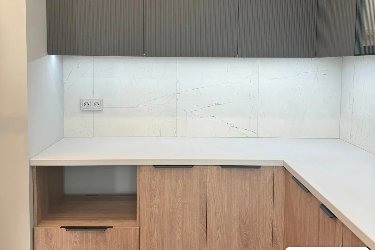
An example is our corner kitchen in grey-beige. The fronts are matt, flat and handleless, and the units reach the ceiling. The contrast comes from a black gloss worktop that continues into a peninsula table on a slim black frame. Without this dark accent, the beige could blend into a flat whole.
Beige gloss kitchens are a frequent question. Gloss reflects light, so it brightens a small or poorly lit kitchen. Matt hides fingerprints better and looks calmer in a kitchen open to the living room. Both finishes can be combined in one run of units. Gloss then goes at the top and matt at the bottom, where the fronts are touched most often. That is what we did in the kitchen with white gloss at the top described above.
Navy kitchen: a colour to use in doses
A navy kitchen looks best with white, brown and warm gold. Navy is used sparingly. Too much of it can overwhelm a room and make it gloomy. In a smaller kitchen it is better brought in as an accent, on the lower row, the island or a tall unit.
Navy works in a similar way to dark green. It needs a light worktop or a light wall above the worktop so that it does not merge with the shadow under the cabinets. You will find ideas for such pairings in our article on the worktop and the wall above it.
Colour in a made-to-measure kitchen: from colour chart to order
In a made-to-measure kitchen, the colour is chosen together with the design, not separately. The visualisation shows how a dark level of cabinets works with the worktop and floor. When ordering the units, it is worth going through four steps.
- Gather what stays. A photo or sample of the floor, the colour of the window frames and the chosen worktop. Every front colour is compared with them.
- Check the light. Which side the window faces and how the kitchen looks in the evening. With north light, warmer shades are chosen.
- Decide where the strong colour goes. All the units, one level or one piece of furniture. In a small kitchen, one level or one piece usually wins.
- Look at colours on site. Colours from the chart, viewed over a few days at different times and in the kitchen's own light.
The cost of a coloured kitchen depends mainly on the front finish, the number of fronts and whether the colour covers all the units or only some. The worktop, lighting and built-in appliances come on top. We calculate the exact amount after the measurement and put the price in the contract.
We have been making made-to-measure furniture for over 15 years and have completed more than 300 projects. The laser measurement is free. After it we prepare a design with a visualisation and a quote. Production usually takes 2–4 weeks, and the exact date goes into the contract. If you have already chosen the kitchen colour or have two options left to compare, you can book a measurement.
Colours on screen and in photos differ from the real ones. The final choice is best made by the number from the colour chart, in the light of the kitchen where the furniture will stand.
Frequently asked questions
What worktop goes with a green kitchen?
A green kitchen most often suits a wooden or wood-effect worktop, which warms the green. A light worktop, white or with a light marble pattern, brightens dark green. With the light green island from our project, the worktop is dark with a marble pattern, the same as the worktop and wall above it in the surrounding units.
What wall colour goes with a black or graphite kitchen?
With dark fronts, the walls usually stay light, most often white. A light surface reflects the light that black and graphite fronts hardly give back.
What handles suit a green or navy kitchen?
Gold or brass handles warm up dark green and navy well. Black handles suit light green because they echo the black of the appliances and sink. Handleless fronts opened with a profile leave the colour as one smooth surface.